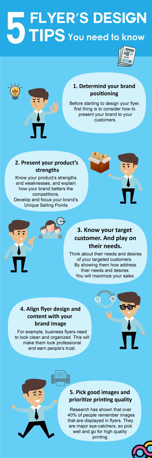
Ever had that moment when you tried to design some flyers but the result is utterly @$!@#@?????
Well, to all of you poor souls out there, worry not! We at Gogoprint have prepared "5 tips for designing flyers to match your target audience” that will definitely catch the attention of all those who see it.
But wait! Before we get down and dirty with the details, you might be wondering why anyone would want to use flyers for marketing (it’s 2018, for digital sake!).
 <
<
To keep things short, flyers are still considered to be a very important offline marketing tool. This is due to the fact that as when they are handed to you, a moment of your attention is spent on those flyers and you are exposed to whatever brand is on them, creating a powerful impact and a long-lasting impression, which could further lead to brand-recognition in the future. Another benefit is that your brand will not have to compete against other distractions or noises that you might find on digital-marketing platforms for views (Facebook, Google, etc.).
With that out of the way, let’s start with the tips.
1. Know the objective!
Before you begin on the design, you will first need to know about what you are trying to achieve by using the flyers in the first place. Is it brand awareness? Are you trying to generate leads? Once you have the objective in mind, it will be more easier and clearer to create your design. A great design is measured by how easy it is for your customer to understand the message that you are trying to express. If you get this first tip right, you are on the right track!
2. Know the market position of your brand!
The more you know about the pros and cons of your brand, the more easier it is to make your brand different from other brands and stand out! Highlight the brand’s strengths as selling-points, while offsetting its weaknesses. For example, if your brand features fast service, make that point clear to people on the flyers. If your food is fresh and cheap, emphasize those points in the design. Use eye-catching colors to catch people’s attention as it is likely that people would just give only one look at your flyers. Be unique in your own way and don’t imitate others.
3. Know your target audience!
Another necessary aspect that should be considered in designing flyers is to know your target audience. Have a clear definition of who they are - the demographics, interest, spending power, etc. When you have these details, it will become easier to decide on what message to put across on your flyers that would match and meet both the needs of the customer and the brand. For example, if you have a small business that targets people with a low-to-medium income, your flyers should display a price that is consistent with the income level of those people. The design of the flyers must be professional, but simple, not too luxurious. If your flyers have a design that is too elegant, it is possible that those people might perceive your brand as being too expensive, deterring them from your business.
4. Know the occasion!
The design of the flyers must be consistent with the occasion that they are being used for. For example, if you want to use flyers to build credibility for your business, the design must be professional to be credible. Another example, you want to invite other people to a party that you are hosting by handing out flyers. Your flyers need to be colorful, fun, and exciting, to persuade those people that they will have a great time at your party.
5. Quality of publication
Based on a research by Silpakorn University, up to 41.30 percent of respondents said that they were able to recall a flyer that they have just seen once because of an image that stood out on the flyer. This shows the importance of the image quality. Therefore, to make the flyer design, make sure that you use images with the highest of quality. This reasoning could also extend to other inputs needed to create the flyers - paper quality, printer quality, to make sure that your flyers stay at the top of people’s mind.
And there you go, our “five tips for designing flyers to match your target audience”. If you are looking for more flyer designs that would turn some heads, here’s the link! Please also read a continuation of this blog - “5 Flyer Design Ideas You Might Not Know Before!”. Do not forget to share them with your friends. Stay tune for more and see you in the next article.


